


- About Us
- Colleges & Schools
- Faculty & Staff
- Academics
- Research & Innovation
- Admissions
- Global Engagement
- Campus Life

At the heart of the logo is the acronym "EIT," rendered in a clean, modern typeface. The design uses a vibrant color scheme of red and yellow: red signifies the passion, innovation, and vitality that drive our pioneering research, while yellow represents the wisdom, brightness, and hope at the core of our educational mission. Together, these elements create a striking and memorable mark that balances the institution's rigorous character with its open, inclusive perspective. This logo powerfully captures the dynamic energy and boundless potential of EIT as an emerging, research-focused university.

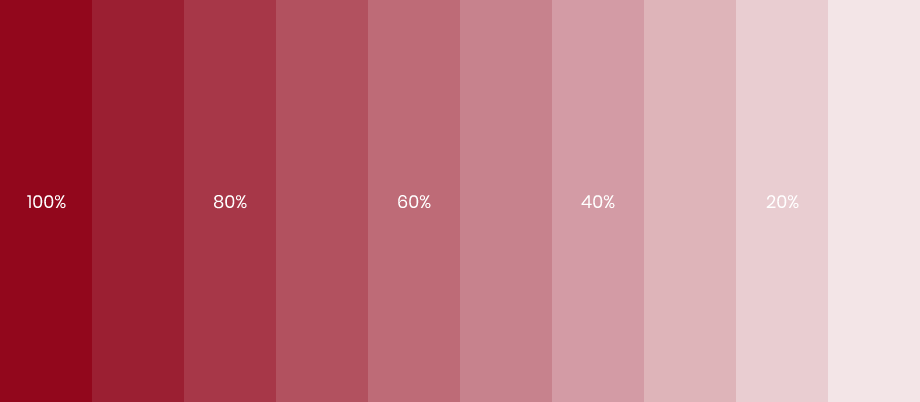

Our complementary color palettes add variety and flexibility to the EIT brand identity. They are carefully chosen to ensure our communications are visually striking and consistent everywhere they appear. Use these colors to create different moods and visual interest, while always following the guidelines in this manual to protect the integrity of our brand.

